SW Stahl
Brand transformation
SW Stahl
Exceptionally efficient development of a powerful tool brand.
Project Assets
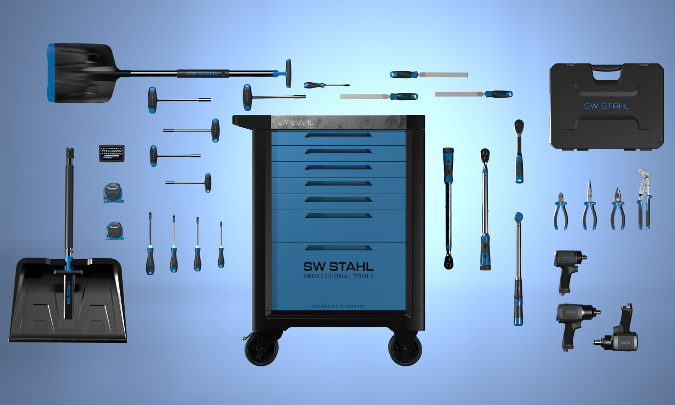
The collaboration between SW Stahl and Squareone has enabled the transformation from an established retail brand to a strong, design-oriented quality brand for innovative tool solutions. Squareone brought extensive expertise in the conception of new tools, design, packaging design and web-based brand communication. Squareone was particularly valuable in the development of a uniform design language - the "Pulse Line" - which unites the product diversity under a strong brand umbrella and shapes the distinctive appearance of SW Stahl. The consistent implementation of these design elements has set SW Stahl apart from the competition and strengthened customer confidence. The integration of the award-winning design language into the overall brand image demonstrates the deep bond between product and brand and the valuable role Squareone has played in strengthening this connection. This not only made SW Stahl visually unique, but also enabled it to consolidate its position in the market as an innovative and trusted tool brand.

Design system
Seriusand lively: The Pulse Line
The vibrant partnership between SW Stahl and Squareone highlights how we use design as a communication language to convey values and reinforce brand identities. We were faced with the challenge of developing a coherent design language for SW Stahl's automotive tool portfolio that exists in parallel with their corporate identity. Our goal was to create a design that was clear, balanced and easily transferable to different types of tools. The result of this creative collaboration is the "Pulse Line," a distinctive design element that runs through all of SW Stahl's products and two-dimensional touchpoints.


Product
Confidence in elaboration and performance
Confidence and performance are two sides of the same coin, which are reflected in our design for SW Stahl. Clearly defined contours and surfaces, coupled with a high-quality finish, exude a professional character. Recurring material separations and lines contribute to the iconic appearance and set SW Stahl apart from the competition. The consistent application of these design elements creates a coherent visual identity that makes the brand unmistakable and strengthens customer trust.


Web, Print & Package
Harmony with the hardware
The integration of the design language into the overall brand image of SW Stahl underlines the close connection between product and brand. The black color scheme of the products is reflected in the backgrounds of the website, the packaging and the print media, always in harmony with the "Pulse Line" and other blue accents in the characteristic SW Stahl blue.


